Objective
Modernize the brand and UI for Top Pot’s website to help improve the user’s experience to increase sales and reputation.
Problem
Top Pot’s website looks outdated and is difficult to navigate. Users struggle to find the information they need and often end up calling to ask questions that could be answered online.
Goals
Create a beautiful brand for Top Pot’s website with easy-to-use navigation and a well-organized menu of doughnuts.
My Role
Market research
Information architecture
Brand expression
Wire framing
UI design
Illustration
Tools
Sketch
Adobe Illustrator
Adobe Photoshop
Adobe Acrobat
Material design
Existing website
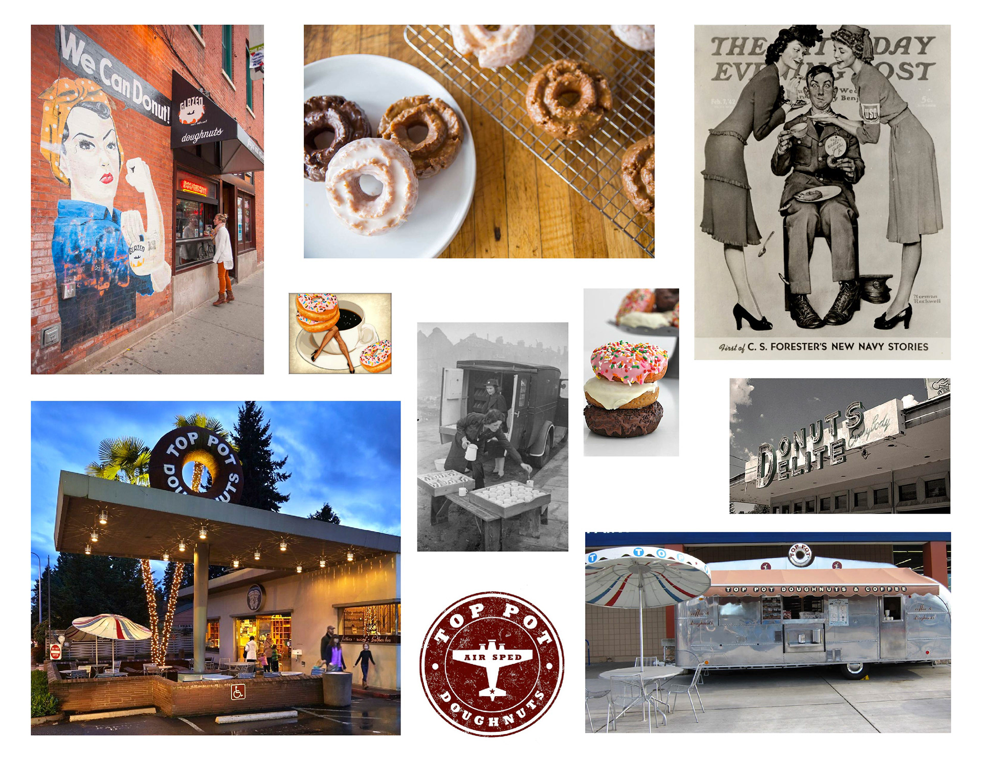
Mood board
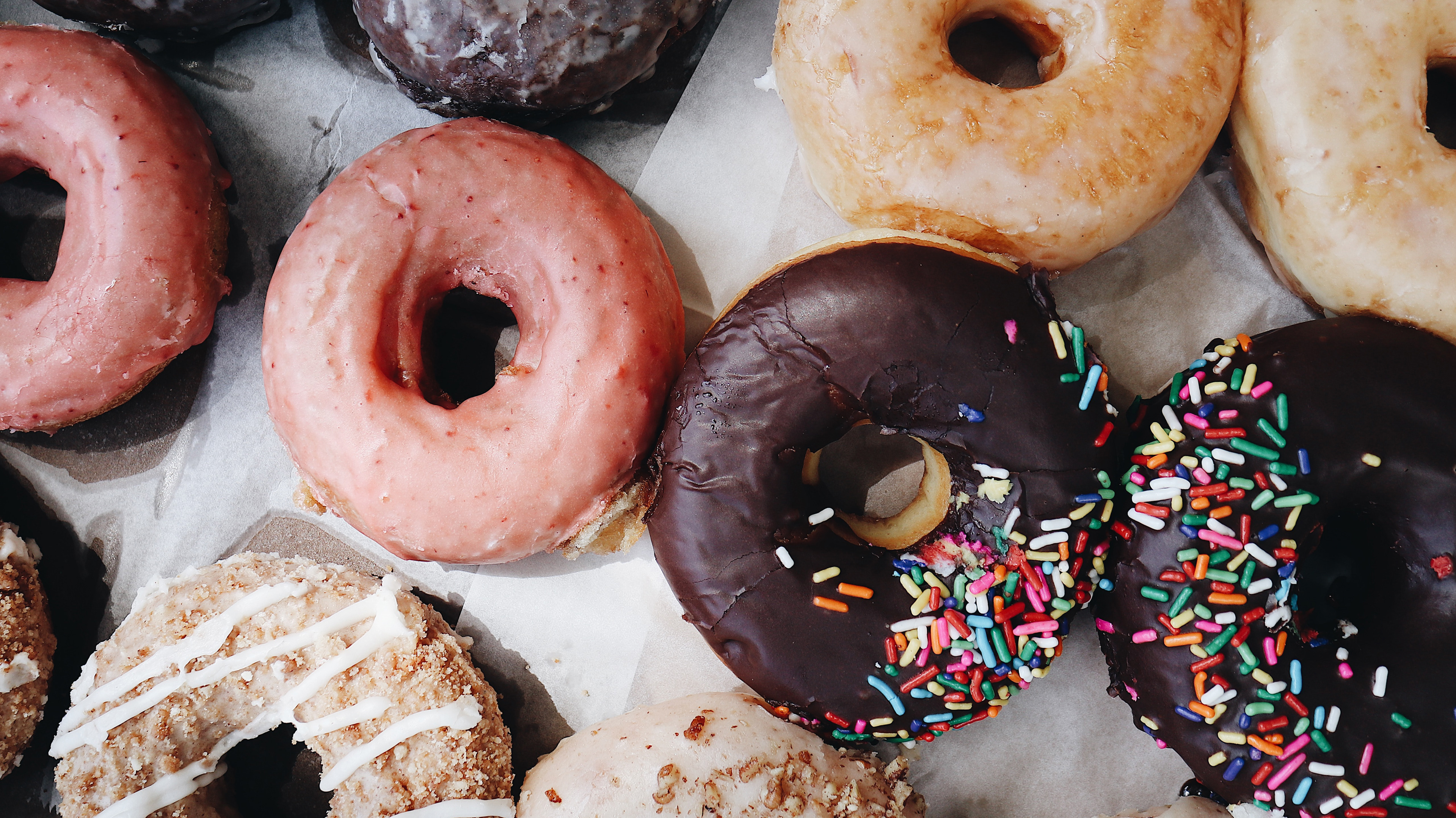
Top Pot Doughnuts has a vintage aesthetic which has brought them a long way. In this mood board, I wanted to capture some of those elements to show the roots of their brand and draw attention to the hard-working people to which they cater.
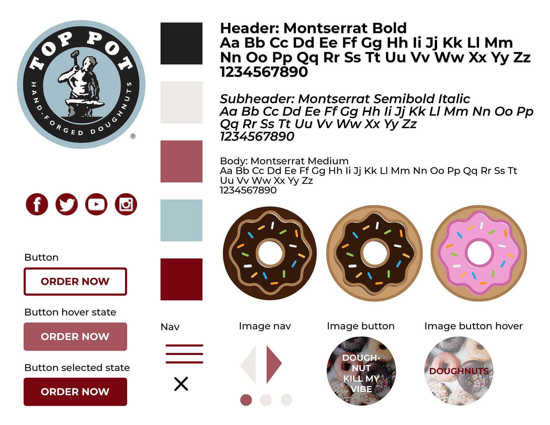
Style Board
In this brand expression, I mixed the old with the new by using similar brand elements and the original logo, then combined colorful photography and playful doughnut illustrations to modernize.
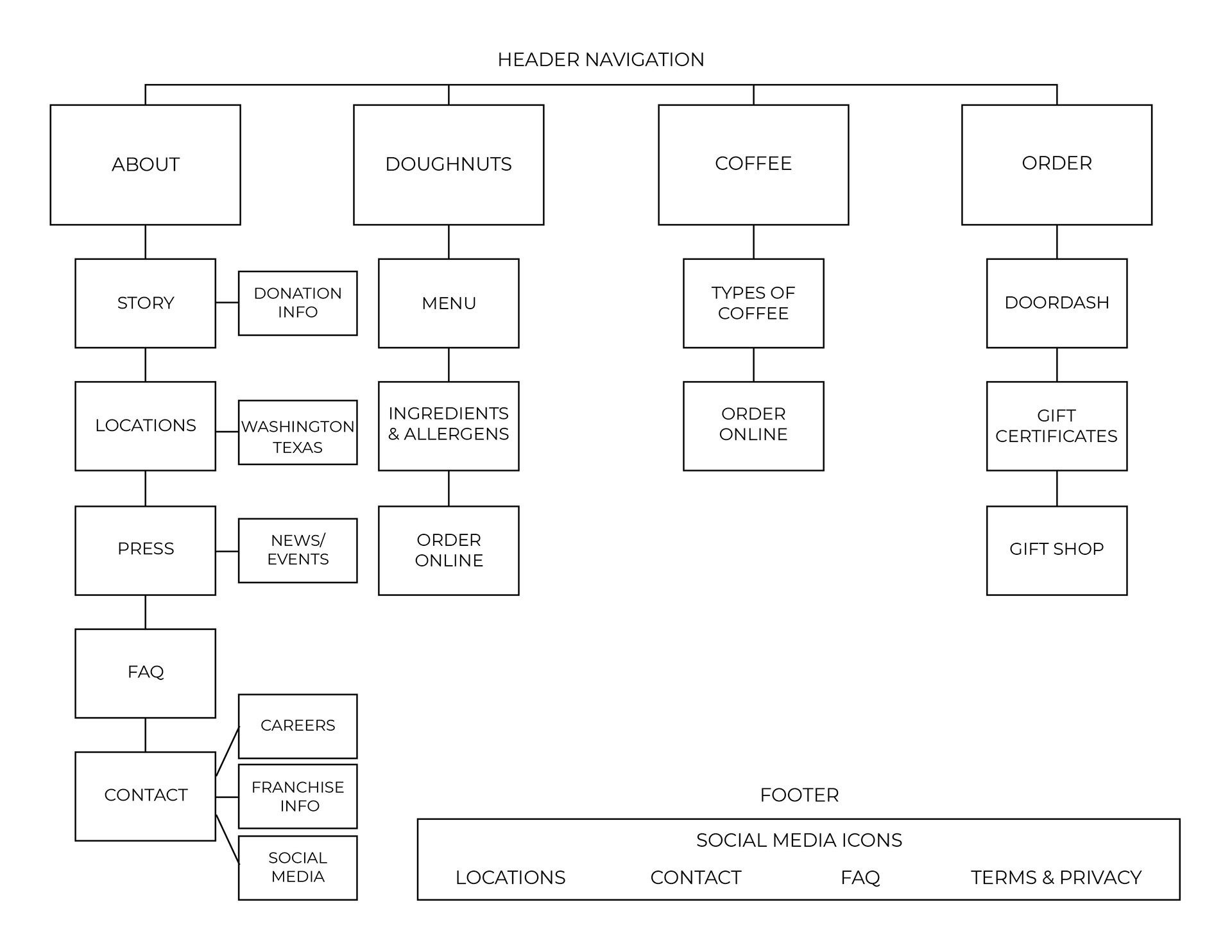
Site Map
The existing website offered too many options in the header navigation, so it was important to organize them into categories for dropdown menus.
Wire Frames
Desktop and mobile wires for the home page and doughnut menu.
Solution
The home page offers header navigation directing you to different areas of the website, as well as localization, a link to online ordering, and featured Instagram posts to encourage users to connect on social media. The footer navigation provides access to less common needs and quick contact information.

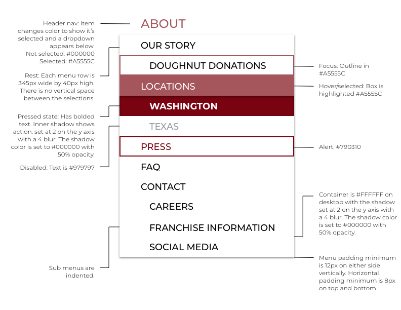
Home, desktop & mobile dropdown menu
Dropdown component requirements
• The header navigation has been organized into main categories with dropdown menus for exploring further sub-navigation on the site.
• On mobile the navigation is under a hamburger menu in the top right-hand corner. That menu shows all main navigation with sub-navigation nested.
• When you hover over the main nav links the color changes so you know which menu you are exploring.
• Each option on the list highlights as you hover over with your mouse, or has a focus box if you are tabbing to show that you may select that option.
• The menu option will again change color to show when you have selected as a pressed state.
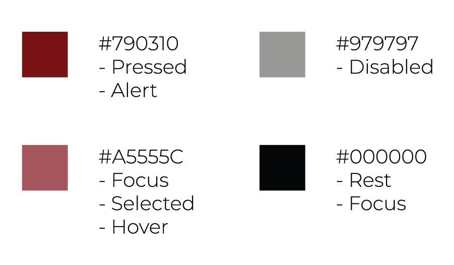
Colors
Dropdown component
Doughnuts, desktop & mobile
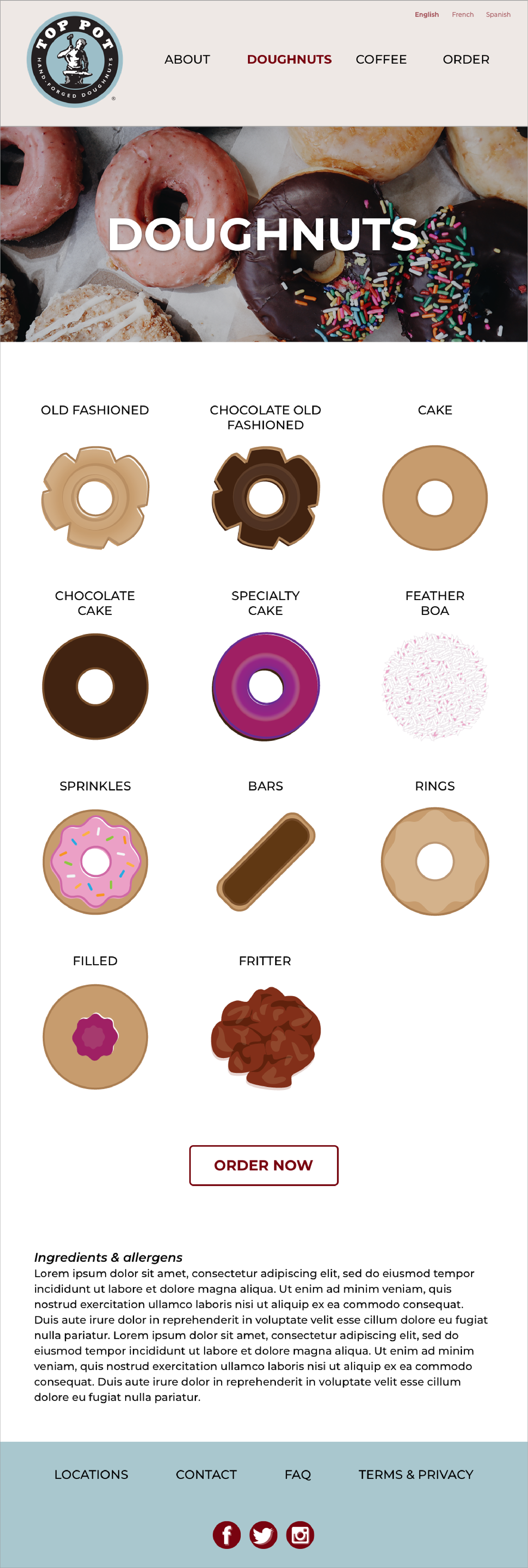
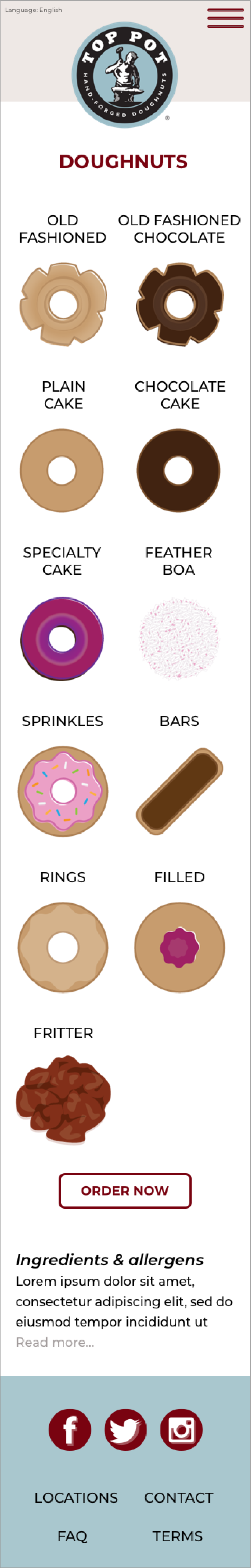
Desktop & mobile product description light boxes.


